## Galeria de Gráficos R 🎨
```{r}
#| label: setup
#| message: false
library(ggplot2)
library(plotly)
library(gganimate)
library(dplyr)
```
```{r}
#| label: dados-simulados
# Simula 1 ano de mensagens (dados tipo WhatsApp)
set.seed(42)

# Por dia
dias <- seq(as.Date("2024-10-01"), as.Date("2025-10-31"), by = "day")
df_diario <- data.frame(
  data = rep(dias, each = 2),
  remetente = rep(c("Você 💙", "Ela 💕"), length(dias)),
  msgs = c(rbind(
    rpois(length(dias), 45),  # P1: média 45 msgs/dia
    rpois(length(dias), 52)   # P2: média 52 msgs/dia
  ))
)

# Agrega por mês
df_mensal <- df_diario %>%
  mutate(mes = format(data, "%Y-%m")) %>%
  group_by(mes, remetente) %>%
  summarise(total = sum(msgs), .groups = "drop") %>%
  mutate(mes_num = as.numeric(factor(mes)))

# Por hora do dia
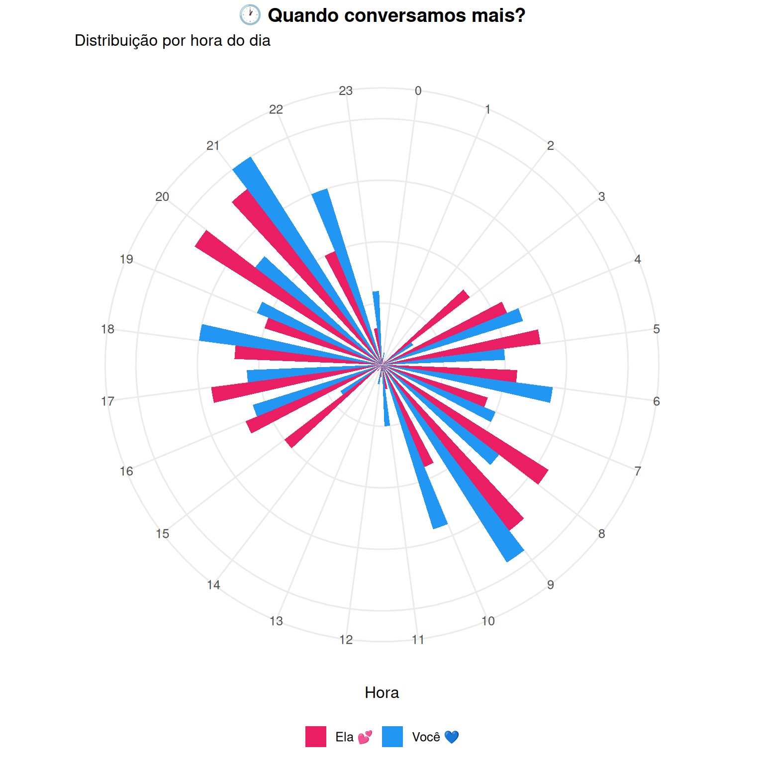
df_hora <- data.frame(
  hora = rep(0:23, each = 2),
  remetente = rep(c("Você 💙", "Ela 💕"), 24),
  msgs = c(
    # Você
    5, 3, 1, 0, 0, 2, 15, 45, 60, 55, 50, 65,
    70, 55, 50, 45, 60, 80, 95, 85, 70, 45, 25, 10,
    # Ela
    8, 5, 2, 1, 0, 3, 20, 50, 55, 60, 55, 70,
    75, 60, 55, 50, 65, 90, 100, 90, 75, 50, 30, 15
  )
)
```
---
### 1️⃣ Racing Bar Chart (Acumulado por mês)
```{r}
#| label: racing-bar
df_acumulado <- df_mensal %>%
  arrange(remetente, mes_num) %>%
  group_by(remetente) %>%
  mutate(acumulado = cumsum(total)) %>%
  ungroup()

p_race <- ggplot(df_acumulado, aes(x = remetente, y = acumulado, fill = remetente)) +
  geom_col(width = 0.6) +
  geom_text(aes(label = format(acumulado, big.mark = ".")),
            hjust = -0.1, size = 5, fontface = "bold") +
  coord_flip() +
  scale_fill_manual(values = c("Você 💙" = "#2196F3", "Ela 💕" = "#E91E63")) +
  scale_y_continuous(limits = c(0, 22000)) +
  theme_minimal(base_size = 14) +
  theme(
    legend.position = "none",
    panel.grid.major.y = element_blank(),
    plot.title = element_text(face = "bold", size = 18)
  ) +
  labs(
    title = "Total de mensagens: {closest_state}",
    x = NULL,
    y = "Mensagens acumuladas"
  ) +
  transition_states(mes, transition_length = 3, state_length = 1) +
  ease_aes('cubic-in-out')

animate(p_race, nframes = 150, fps = 15, width = 700, height = 300)
```
---
### 2️⃣ Linha do Tempo Animada
```{r}
#| label: timeline
df_timeline <- df_mensal %>%
  mutate(mes_date = as.Date(paste0(mes, "-01")))

p_line <- ggplot(df_timeline, aes(x = mes_date, y = total, color = remetente)) +
  geom_line(size = 1.5) +
  geom_point(size = 4) +
  scale_color_manual(values = c("Você 💙" = "#2196F3", "Ela 💕" = "#E91E63")) +
  scale_x_date(date_labels = "%b/%y", date_breaks = "2 months") +
  theme_minimal(base_size = 14) +
  theme(
    legend.position = "bottom",
    plot.title = element_text(face = "bold")
  ) +
  labs(
    title = "Nossa conversa ao longo do tempo 💬",
    subtitle = "Mensagens por mês",
    x = NULL,
    y = "Mensagens",
    color = NULL
  ) +
  transition_reveal(mes_date)

animate(p_line, nframes = 100, fps = 10, width = 800, height = 400)
```
---
### 3️⃣ Relógio de Atividade (Polar)
```{r}
#| label: relogio
#| fig-width: 8
#| fig-height: 8
p_clock <- ggplot(df_hora, aes(x = factor(hora), y = msgs, fill = remetente)) +
  geom_bar(stat = "identity", position = "dodge", width = 0.7) +
  coord_polar(start = 0) +
  scale_fill_manual(values = c("Você 💙" = "#2196F3", "Ela 💕" = "#E91E63")) +
  theme_minimal(base_size = 12) +
  theme(
    axis.text.y = element_blank(),
    axis.ticks = element_blank(),
    panel.grid.minor = element_blank(),
    legend.position = "bottom",
    plot.title = element_text(face = "bold", hjust = 0.5)
  ) +
  labs(
    title = "🕐 Quando conversamos mais?",
    subtitle = "Distribuição por hora do dia",
    x = "Hora",
    y = NULL,
    fill = NULL
  )

p_clock
```
---
### 4️⃣ Heatmap Interativo (Dia da Semana x Hora)
```{r}
#| label: heatmap
# Gera dados de heatmap
df_heat <- expand.grid(
  dia = c("Seg", "Ter", "Qua", "Qui", "Sex", "Sáb", "Dom"),
  hora = 0:23
) %>%
  mutate(
    msgs = case_when(
      dia %in% c("Sáb", "Dom") & hora %in% 10:23 ~ rpois(n(), 80),
      dia %in% c("Sáb", "Dom") ~ rpois(n(), 20),
      hora %in% 8:12 ~ rpois(n(), 50),
      hora %in% 13:18 ~ rpois(n(), 40),
      hora %in% 19:23 ~ rpois(n(), 70),
      TRUE ~ rpois(n(), 10)
    )
  )

df_heat$dia <- factor(df_heat$dia, levels = c("Seg", "Ter", "Qua", "Qui", "Sex", "Sáb", "Dom"))

p_heat <- ggplot(df_heat, aes(x = hora, y = dia, fill = msgs)) +
  geom_tile(color = "white", size = 0.5) +
  scale_fill_gradient2(
    low = "#fff5f5",
    mid = "#ff69b4",
    high = "#c51162",
    midpoint = 50
  ) +
  scale_x_continuous(breaks = seq(0, 23, 3), expand = c(0, 0)) +
  theme_minimal(base_size = 12) +
  theme(
    panel.grid = element_blank(),
    plot.title = element_text(face = "bold"),
    legend.position = "bottom"
  ) +
  labs(
    title = "🔥 Mapa de Calor das Conversas",
    x = "Hora do dia",
    y = NULL,
    fill = "Msgs"
  )

ggplotly(p_heat)
```
---
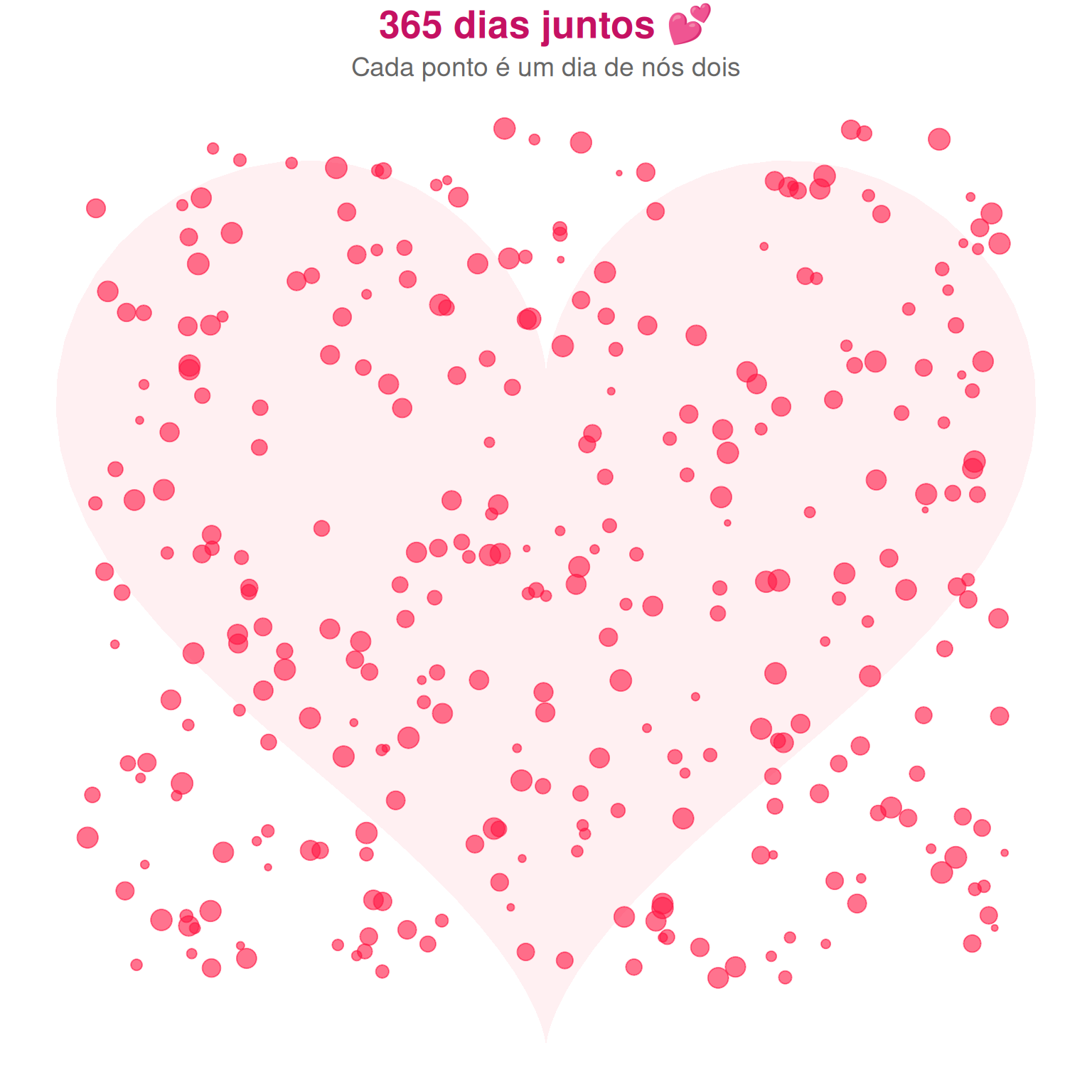
### 5️⃣ Coração de Pontos 💕 (Especial!)
```{r}
#| label: coracao
#| fig-width: 8
#| fig-height: 8
# Fórmula do coração
t <- seq(0, 2*pi, length.out = 100)
heart <- data.frame(
  x = 16 * sin(t)^3,
  y = 13*cos(t) - 5*cos(2*t) - 2*cos(3*t) - cos(4*t)
)

# Pontos aleatórios dentro do coração
set.seed(42)
n_points <- 365  # 1 ponto por dia do ano
points_heart <- data.frame(
  x = runif(n_points, -16, 16),
  y = runif(n_points, -17, 14)
) %>%
  mutate(
    inside = (x^2 + y^2 - 1)^3 - x^2 * y^3 < 10,
    dia = 1:n_points,
    tamanho = runif(n_points, 50, 150)
  ) %>%
  filter(abs(x) < 15 & y > -15 & y < 13)

p_heart <- ggplot() +
  geom_polygon(data = heart, aes(x, y), fill = "#ffccd5", alpha = 0.3) +
  geom_point(data = points_heart, aes(x, y, size = tamanho),
             color = "#ff1744", alpha = 0.6) +
  scale_size_continuous(range = c(1, 5)) +
  theme_void() +
  theme(
    legend.position = "none",
    plot.title = element_text(face = "bold", hjust = 0.5, size = 20, color = "#c51162"),
    plot.subtitle = element_text(hjust = 0.5, size = 14, color = "#666")
  ) +
  labs(
    title = "365 dias juntos 💕",
    subtitle = "Cada ponto é um dia de nós dois"
  ) +
  coord_fixed()

p_heart
```
---
### 6️⃣ Coração Animado (Pulsa!)
```{r}
#| label: coracao-animado
# Coração que pulsa
frames <- 20
heart_anim <- do.call(rbind, lapply(1:frames, function(i) {
  scale <- 1 + 0.1 * sin(2 * pi * i / frames)
  data.frame(
    x = scale * 16 * sin(t)^3,
    y = scale * (13*cos(t) - 5*cos(2*t) - 2*cos(3*t) - cos(4*t)),
    frame = i
  )
}))

p_pulse <- ggplot(heart_anim, aes(x, y)) +
  geom_polygon(fill = "#ff1744", alpha = 0.8) +
  theme_void() +
  theme(
    plot.title = element_text(face = "bold", hjust = 0.5, size = 24, color = "#c51162")
  ) +
  labs(title = "💕 1 ano 💕") +
  coord_fixed() +
  transition_manual(frame)

animate(p_pulse, nframes = 40, fps = 20, width = 400, height = 400)
```