---
title: "Galeria de Visualizações WhatsApp 💕"
subtitle: "Ideias criativas para o presente de 1 ano"
format:
html:
toc: true
toc-depth: 2
---
```{r}
#| label: setup
#| message: false
#| warning: false
# Pacotes necessários
library(ggplot2)
library(plotly)
library(gganimate)
library(dplyr)
library(tidyr)
library(lubridate)

# Tenta carregar pacotes extras (instala se precisar)
if (!require(ggtext)) install.packages("ggtext", quiet = TRUE)
if (!require(ggbump)) install.packages("ggbump", quiet = TRUE)
if (!require(ggwordcloud)) install.packages("ggwordcloud", quiet = TRUE)
if (!require(scales)) install.packages("scales", quiet = TRUE)

library(ggtext)
library(ggbump)
library(ggwordcloud)
library(scales)
```
```{r}
#| label: dados-base
#| message: false
# Simula dados realistas de 1 ano de WhatsApp
set.seed(42)

# Datas do relacionamento
inicio <- as.Date("2024-10-15")
fim <- as.Date("2025-10-15")
dias <- seq(inicio, fim, by = "day")

# Dados diários
df_diario <- data.frame(
  data = rep(dias, each = 2),
  remetente = rep(c("Você 💙", "Ela 💕"), length(dias))
) %>%
  mutate(
    dia_semana = wday(data, label = TRUE),
    fim_semana = dia_semana %in% c("Sat", "Sun"),
    mes = floor_date(data, "month"),
    # Mais msgs no fim de semana e à noite
    msgs = rpois(n(), ifelse(fim_semana, 55, 42) + ifelse(remetente == "Ela 💕", 5, 0))
  )

# Dados mensais
df_mensal <- df_diario %>%
  group_by(mes, remetente) %>%
  summarise(total = sum(msgs), .groups = "drop")

# Dados por hora
df_hora <- expand.grid(
  hora = 0:23,
  remetente = c("Você 💙", "Ela 💕")
) %>%
  mutate(
    msgs = case_when(
      hora %in% 0:5 ~ rpois(n(), 5),
      hora %in% 6:8 ~ rpois(n(), 25),
      hora %in% 9:12 ~ rpois(n(), 45),
      hora %in% 13:17 ~ rpois(n(), 40),
      hora %in% 18:21 ~ rpois(n(), 75),
      hora %in% 22:23 ~ rpois(n(), 35)
    ) + ifelse(remetente == "Ela 💕", rpois(n(), 5), 0)
  )

# Emojis mais usados
df_emojis <- data.frame(
  emoji = c("❤️", "😂", "😘", "🥰", "😊", "💕", "🤣", "😍", "🙈", "✨"),
  voce = c(450, 380, 320, 280, 250, 220, 200, 180, 150, 120),
  ela = c(520, 340, 410, 350, 280, 380, 180, 290, 200, 190)
) %>%
  pivot_longer(cols = c(voce, ela), names_to = "remetente", values_to = "count") %>%
  mutate(remetente = ifelse(remetente == "voce", "Você 💙", "Ela 💕"))

# Palavras mais usadas
df_palavras <- data.frame(
  palavra = c("amor", "te", "amo", "você", "bom", "dia", "boa", "noite",
              "saudade", "lindo", "linda", "muito", "hoje", "vem", "tá",
              "né", "sim", "não", "ok", "beijo", "meu", "minha", "nosso",
              "casa", "trabalho", "cansado", "fome", "sono", "quero", "vamos"),
  freq = c(1200, 1150, 980, 920, 850, 820, 800, 780, 650, 620, 600, 580,
           550, 520, 500, 480, 450, 430, 400, 380, 360, 340, 320, 300,
           280, 260, 240, 220, 200, 180)
)

# Sentimento por mês
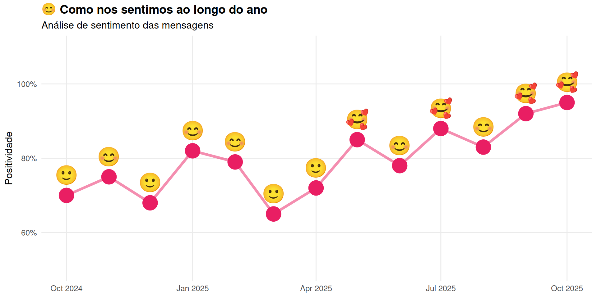
df_sentimento <- df_mensal %>%
  select(mes) %>%
  distinct() %>%
  mutate(
    sentimento = c(0.7, 0.75, 0.68, 0.82, 0.79, 0.65, 0.72, 0.85, 0.78, 0.88, 0.83, 0.92, 0.95),
    emoji = case_when(
      sentimento >= 0.85 ~ "🥰",
      sentimento >= 0.75 ~ "😊",
      sentimento >= 0.65 ~ "🙂",
      TRUE ~ "😐"
    )
  )
```
---
# 📊 Gráficos de Padrão
## 1. Calendário Heatmap (estilo GitHub)
```{r}
#| label: calendario-heatmap
#| fig-width: 12
#| fig-height: 4
df_calendario <- df_diario %>%
  group_by(data) %>%
  summarise(total = sum(msgs)) %>%
  mutate(
    semana = week(data),
    dia_semana = wday(data, label = TRUE, week_start = 1),
    mes = month(data, label = TRUE)
  )

# Ajusta semana pra visualização contínua
df_calendario <- df_calendario %>%
  arrange(data) %>%
  mutate(semana_continua = as.numeric(difftime(data, min(data), units = "weeks")) %/% 1)

ggplot(df_calendario, aes(x = semana_continua, y = fct_rev(dia_semana), fill = total)) +
  geom_tile(color = "white", size = 0.5) +
  scale_fill_gradient(low = "#ebedf0", high = "#e91e63") +
  theme_minimal(base_size = 12) +
  theme(
    panel.grid = element_blank(),
    axis.text.x = element_blank(),
    plot.title = element_text(face = "bold", size = 16),
    legend.position = "bottom"
  ) +
  labs(
    title = "📅 365 dias de conversa",
    subtitle = "Cada quadrado é um dia — quanto mais escuro, mais mensagens",
    x = NULL,
    y = NULL,
    fill = "Mensagens"
  ) +
  coord_fixed(ratio = 1)
```
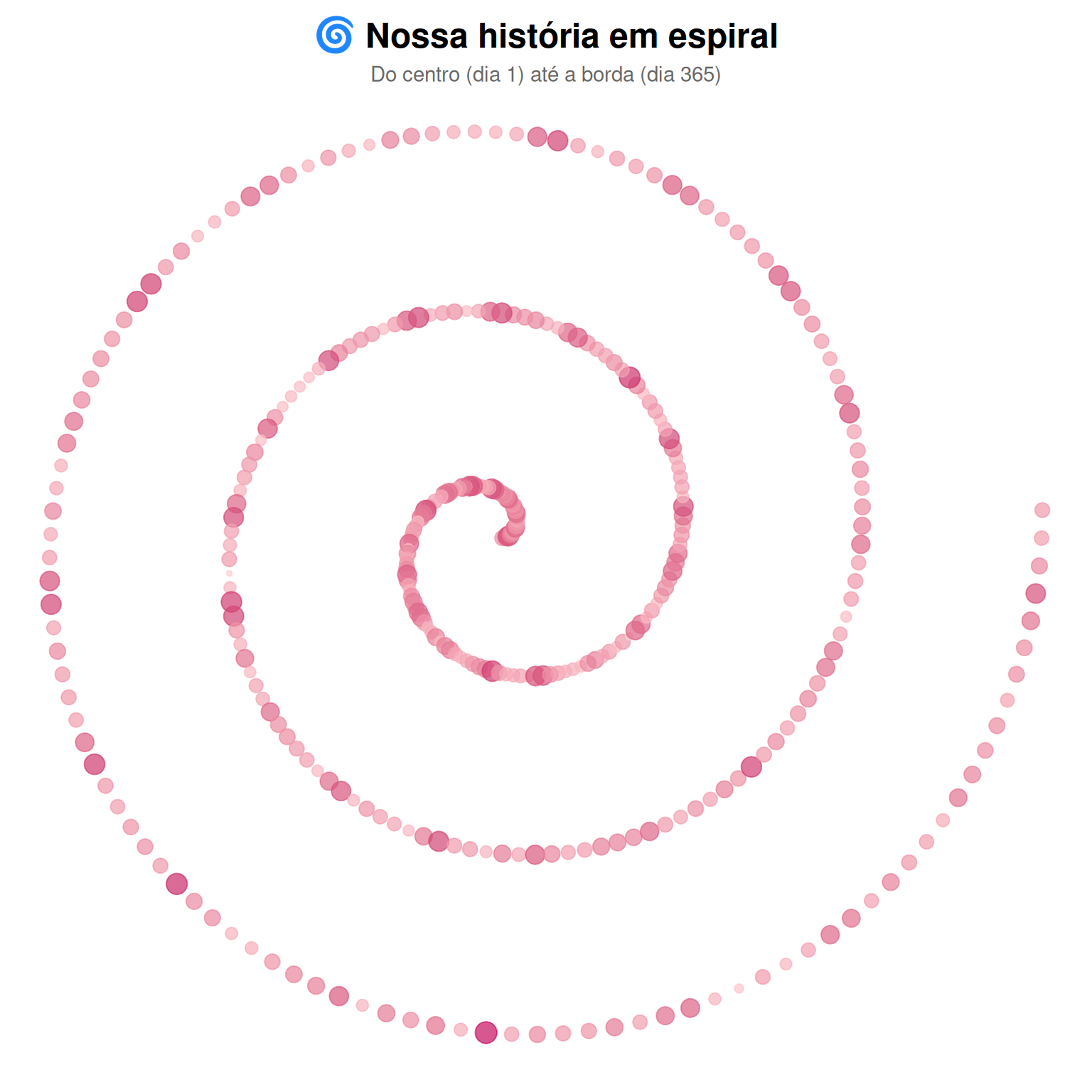
## 2. Spiral Plot (365 dias em espiral)
```{r}
#| label: spiral
#| fig-width: 8
#| fig-height: 8
df_spiral <- df_diario %>%
  group_by(data) %>%
  summarise(total = sum(msgs)) %>%
  mutate(
    dia_ano = as.numeric(data - min(data)) + 1,
    angulo = (dia_ano / 365) * 2 * pi * 3,  # 3 voltas
    raio = dia_ano / 50,
    x = raio * cos(angulo),
    y = raio * sin(angulo)
  )

ggplot(df_spiral, aes(x, y, color = total, size = total)) +
  geom_point(alpha = 0.7) +
  scale_color_gradient(low = "#ffcdd2", high = "#c51162") +
  scale_size_continuous(range = c(1, 5)) +
  theme_void() +
  theme(
    legend.position = "none",
    plot.title = element_text(face = "bold", hjust = 0.5, size = 18),
    plot.subtitle = element_text(hjust = 0.5, color = "#666")
  ) +
  labs(
    title = "🌀 Nossa história em espiral",
    subtitle = "Do centro (dia 1) até a borda (dia 365)"
  ) +
  coord_fixed()
```
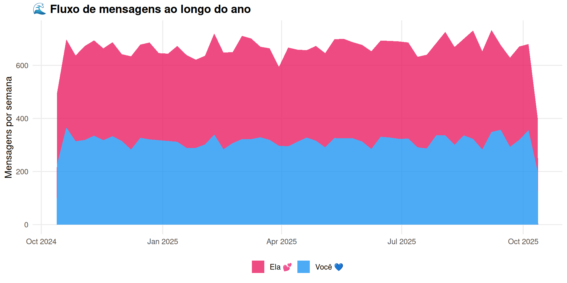
## 3. Area Chart (fluxo de mensagens)
```{r}
#| label: stream
#| fig-width: 10
#| fig-height: 5
df_stream <- df_diario %>%
  mutate(semana = floor_date(data, "week")) %>%
  group_by(semana, remetente) %>%
  summarise(total = sum(msgs), .groups = "drop")

ggplot(df_stream, aes(x = semana, y = total, fill = remetente)) +
  geom_area(alpha = 0.8, position = "stack") +
  scale_fill_manual(values = c("Você 💙" = "#2196F3", "Ela 💕" = "#E91E63")) +
  theme_minimal(base_size = 12) +
  theme(
    panel.grid.minor = element_blank(),
    plot.title = element_text(face = "bold"),
    legend.position = "bottom"
  ) +
  labs(
    title = "🌊 Fluxo de mensagens ao longo do ano",
    x = NULL,
    y = "Mensagens por semana",
    fill = NULL
  )
```
## 4. Bump Chart (ranking mensal)
```{r}
#| label: bump
#| fig-width: 10
#| fig-height: 5
df_bump <- df_mensal %>%
  group_by(mes) %>%
  mutate(rank = rank(-total)) %>%
  ungroup() %>%
  mutate(mes_num = as.numeric(factor(mes)))

ggplot(df_bump, aes(x = mes_num, y = rank, color = remetente)) +
  geom_bump(size = 2, smooth = 8) +
  geom_point(size = 5) +
  scale_y_reverse() +
  scale_color_manual(values = c("Você 💙" = "#2196F3", "Ela 💕" = "#E91E63")) +
  scale_x_continuous(breaks = 1:13, labels = format(unique(df_mensal$mes), "%b")) +
  theme_minimal(base_size = 12) +
  theme(
    panel.grid.minor = element_blank(),
    plot.title = element_text(face = "bold"),
    legend.position = "bottom"
  ) +
  labs(
    title = "🏆 Quem mandou mais mensagens cada mês?",
    subtitle = "Posição 1 = mais mensagens",
    x = NULL,
    y = "Ranking",
    color = NULL
  )
```
---
# 💬 Gráficos de Conteúdo
## 5. Emoji Race (animado)
```{r}
#| label: emoji-race
# Prepara dados acumulados por "frame"
df_emoji_race <- df_emojis %>%
  group_by(emoji) %>%
  summarise(total = sum(count)) %>%
  arrange(desc(total)) %>%
  head(10) %>%
  mutate(
    rank = row_number(),
    # Simula crescimento
    frame = 10
  )

# Cria frames intermediários
frames_emoji <- do.call(rbind, lapply(1:10, function(f) {
  df_emoji_race %>%
    mutate(
      total_atual = total * (f / 10),
      frame = f
    )
}))

p_emoji_race <- ggplot(frames_emoji, aes(x = reorder(emoji, total_atual), y = total_atual)) +
  geom_col(fill = "#E91E63", width = 0.7) +
  geom_text(aes(label = round(total_atual)), hjust = -0.1, size = 5) +
  coord_flip() +
  theme_minimal(base_size = 14) +
  theme(
    panel.grid.major.y = element_blank(),
    plot.title = element_text(face = "bold", size = 18)
  ) +
  labs(
    title = "Top 10 Emojis do Casal 💕",
    x = NULL,
    y = "Vezes usado"
  ) +
  transition_states(frame, transition_length = 2, state_length = 1) +
  ease_aes('cubic-in-out')

animate(p_emoji_race, nframes = 100, fps = 15, width = 600, height = 500)
```
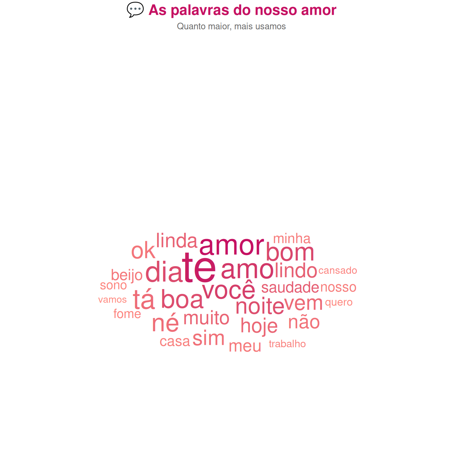
## 6. Wordcloud em forma de coração
```{r}
#| label: wordcloud-heart
#| fig-width: 8
#| fig-height: 8
# Wordcloud simples (forma de coração é mais complexa, mas fica bonito assim)
ggplot(df_palavras, aes(label = palavra, size = freq, color = freq)) +
  geom_text_wordcloud_area(shape = "cardioid", rm_outside = TRUE) +
  scale_size_area(max_size = 24) +
  scale_color_gradient(low = "#ff8a80", high = "#c51162") +
  theme_void() +
  theme(
    plot.title = element_text(face = "bold", hjust = 0.5, size = 18, color = "#c51162"),
    plot.subtitle = element_text(hjust = 0.5, color = "#666")
  ) +
  labs(
    title = "💬 As palavras do nosso amor",
    subtitle = "Quanto maior, mais usamos"
  )
```
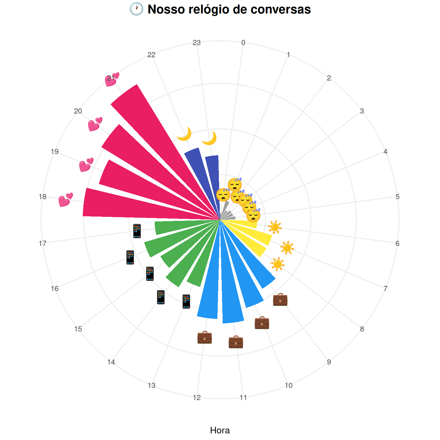
## 7. Emoji Clock (relógio polar com emojis)
```{r}
#| label: emoji-clock
#| fig-width: 8
#| fig-height: 8
df_emoji_hora <- df_hora %>%
  group_by(hora) %>%
  summarise(total = sum(msgs)) %>%
  mutate(
    emoji = case_when(
      hora %in% 0:5 ~ "😴",
      hora %in% 6:8 ~ "☀️",
      hora %in% 9:12 ~ "💼",
      hora %in% 13:17 ~ "📱",
      hora %in% 18:21 ~ "💕",
      hora %in% 22:23 ~ "🌙"
    )
  )

ggplot(df_emoji_hora, aes(x = factor(hora), y = total, fill = emoji)) +
  geom_col(width = 0.8) +
  geom_text(aes(label = emoji), y = df_emoji_hora$total + 20, size = 6) +
  coord_polar(start = 0) +
  scale_fill_manual(values = c(
    "😴" = "#9e9e9e", "☀️" = "#ffeb3b", "💼" = "#2196F3",
    "📱" = "#4caf50", "💕" = "#e91e63", "🌙" = "#3f51b5"
  )) +
  theme_minimal(base_size = 12) +
  theme(
    axis.text.y = element_blank(),
    legend.position = "none",
    plot.title = element_text(face = "bold", hjust = 0.5, size = 16)
  ) +
  labs(
    title = "🕐 Nosso relógio de conversas",
    x = "Hora",
    y = NULL
  )
```
## 8. Sentimento ao longo do tempo (com emojis)
```{r}
#| label: sentimento-emoji
#| fig-width: 10
#| fig-height: 5
ggplot(df_sentimento, aes(x = mes, y = sentimento)) +
  geom_line(color = "#E91E63", size = 1.5, alpha = 0.5) +
  geom_point(color = "#E91E63", size = 8) +
  geom_text(aes(label = emoji), size = 8, vjust = -1) +
  scale_y_continuous(limits = c(0.5, 1.1), labels = scales::percent) +
  theme_minimal(base_size = 12) +
  theme(
    plot.title = element_text(face = "bold"),
    panel.grid.minor = element_blank()
  ) +
  labs(
    title = "😊 Como nos sentimos ao longo do ano",
    subtitle = "Análise de sentimento das mensagens",
    x = NULL,
    y = "Positividade"
  )
```
---
# 💕 Gráficos Especiais (Presente)
## 9. Primeiro vs Último dia
```{r}
#| label: primeiro-ultimo
#| fig-width: 10
#| fig-height: 5
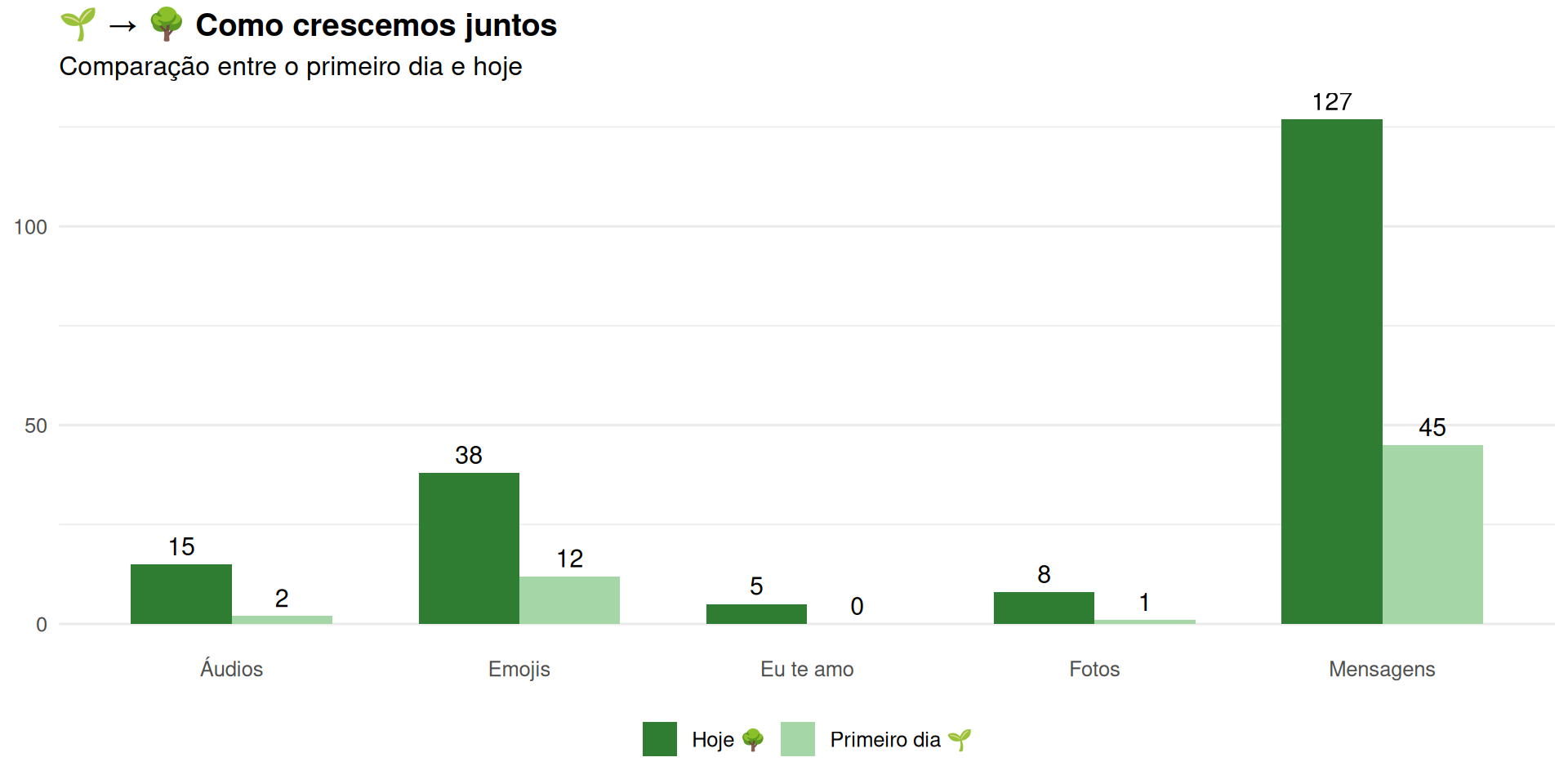
df_comparacao <- data.frame(
  metrica = c("Mensagens", "Emojis", "Áudios", "Fotos", "Eu te amo"),
  primeiro = c(45, 12, 2, 1, 0),
  ultimo = c(127, 38, 15, 8, 5)
) %>%
  pivot_longer(cols = c(primeiro, ultimo), names_to = "dia", values_to = "valor") %>%
  mutate(dia = ifelse(dia == "primeiro", "Primeiro dia 🌱", "Hoje 🌳"))

ggplot(df_comparacao, aes(x = metrica, y = valor, fill = dia)) +
  geom_col(position = "dodge", width = 0.7) +
  geom_text(aes(label = valor), position = position_dodge(width = 0.7), vjust = -0.5, size = 4) +
  scale_fill_manual(values = c("Primeiro dia 🌱" = "#a5d6a7", "Hoje 🌳" = "#2e7d32")) +
  theme_minimal(base_size = 12) +
  theme(
    panel.grid.major.x = element_blank(),
    plot.title = element_text(face = "bold"),
    legend.position = "bottom"
  ) +
  labs(
    title = "🌱 → 🌳 Como crescemos juntos",
    subtitle = "Comparação entre o primeiro dia e hoje",
    x = NULL,
    y = NULL,
    fill = NULL
  )
```
## 10. Contador animado
```{r}
#| label: contador
# Métricas do relacionamento
total_dias <- 365
total_msgs <- sum(df_diario$msgs)
total_horas <- round(total_msgs * 0.5 / 60, 0)  # Estimativa
total_audios <- round(total_msgs * 0.08)
total_fotos <- round(total_msgs * 0.05)

# Cria frames do contador
df_contador <- do.call(rbind, lapply(1:50, function(f) {
  data.frame(
    metrica = c("Dias juntos", "Mensagens", "Horas conversando", "Áudios", "Fotos"),
    valor = c(
      round(total_dias * f/50),
      round(total_msgs * f/50),
      round(total_horas * f/50),
      round(total_audios * f/50),
      round(total_fotos * f/50)
    ),
    emoji = c("📅", "💬", "⏰", "🎙️", "📸"),
    frame = f
  )
}))

p_contador <- ggplot(df_contador, aes(x = metrica, y = valor)) +
  geom_col(fill = "#E91E63", width = 0.6) +
  geom_text(aes(label = paste(emoji, format(valor, big.mark = "."))),
            vjust = -0.5, size = 5, fontface = "bold") +
  theme_minimal(base_size = 14) +
  theme(
    panel.grid = element_blank(),
    axis.text.y = element_blank(),
    plot.title = element_text(face = "bold", hjust = 0.5, size = 20)
  ) +
  labs(
    title = "💕 Nosso ano em números",
    x = NULL,
    y = NULL
  ) +
  transition_states(frame, transition_length = 1, state_length = 0) +
  ease_aes('cubic-out')

animate(p_contador, nframes = 100, fps = 20, width = 700, height = 400)
```
## 11. Constelação de mensagens
```{r}
#| label: constelacao
#| fig-width: 10
#| fig-height: 10
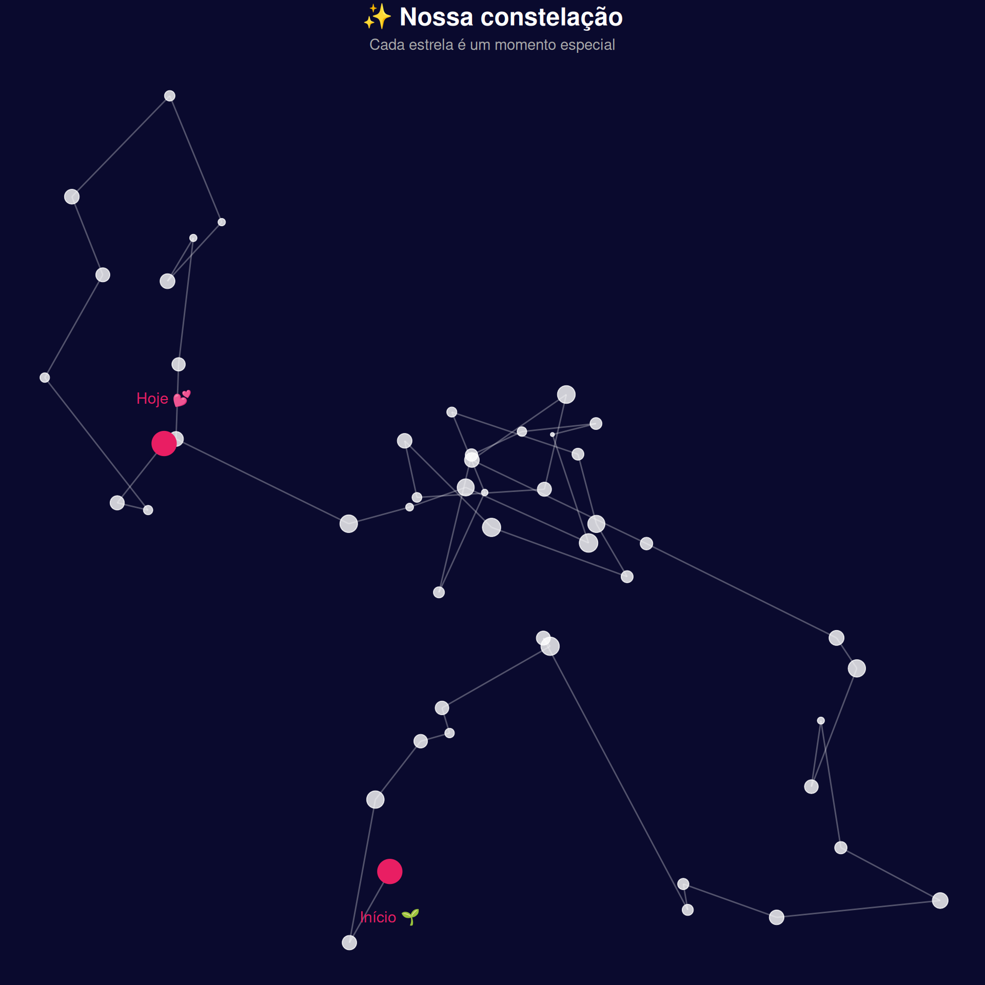
# Cria pontos aleatórios conectados (constelação)
set.seed(42)
n <- 50
df_const <- data.frame(
  x = cumsum(rnorm(n, 0, 1)),
  y = cumsum(rnorm(n, 0, 1)),
  size = runif(n, 1, 5),
  id = 1:n
)

# Conexões
df_lines <- df_const %>%
  mutate(
    xend = lead(x),
    yend = lead(y)
  ) %>%
  filter(!is.na(xend))

ggplot() +
  geom_segment(data = df_lines, aes(x = x, y = y, xend = xend, yend = yend),
               color = "#ffffff", alpha = 0.3, size = 0.5) +
  geom_point(data = df_const, aes(x, y, size = size),
             color = "#ffffff", alpha = 0.8) +
  geom_point(data = df_const %>% filter(id %in% c(1, n)),
             aes(x, y), color = "#E91E63", size = 8) +
  annotate("text", x = df_const$x[1], y = df_const$y[1] - 0.5,
           label = "Início 🌱", color = "#E91E63", size = 4) +
  annotate("text", x = df_const$x[n], y = df_const$y[n] + 0.5,
           label = "Hoje 💕", color = "#E91E63", size = 4) +
  theme_void() +
  theme(
    plot.background = element_rect(fill = "#0a0a2e", color = NA),
    plot.title = element_text(face = "bold", hjust = 0.5, size = 18, color = "white"),
    plot.subtitle = element_text(hjust = 0.5, color = "#aaa")
  ) +
  labs(
    title = "✨ Nossa constelação",
    subtitle = "Cada estrela é um momento especial"
  ) +
  guides(size = "none")
```
## 12. Coração com métricas
```{r}
#| label: coracao-metricas
#| fig-width: 8
#| fig-height: 8
# Coração
t <- seq(0, 2*pi, length.out = 100)
heart <- data.frame(
  x = 16 * sin(t)^3,
  y = 13*cos(t) - 5*cos(2*t) - 2*cos(3*t) - cos(4*t)
)

# Métricas dentro do coração
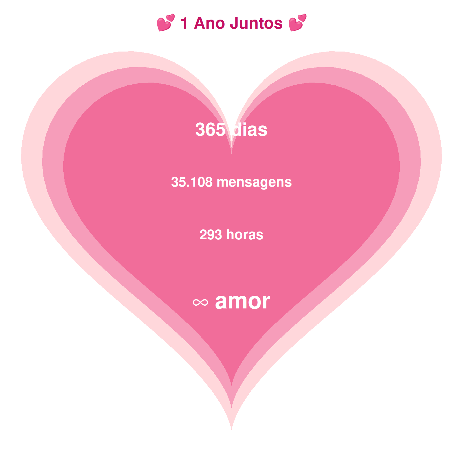
metricas <- data.frame(
  texto = c(
    "365 dias",
    paste0(format(total_msgs, big.mark = "."), " mensagens"),
    paste0(total_horas, " horas"),
    "∞ amor"
  ),
  x = c(0, 0, 0, 0),
  y = c(6, 2, -2, -7),
  size = c(8, 6, 6, 10)
)

ggplot() +
  geom_polygon(data = heart, aes(x, y), fill = "#ffcdd2", alpha = 0.8) +
  geom_polygon(data = heart %>% mutate(x = x*0.9, y = y*0.9),
               aes(x, y), fill = "#f48fb1", alpha = 0.8) +
  geom_polygon(data = heart %>% mutate(x = x*0.8, y = y*0.8),
               aes(x, y), fill = "#f06292", alpha = 0.8) +
  geom_text(data = metricas, aes(x, y, label = texto, size = size),
            color = "white", fontface = "bold") +
  scale_size_identity() +
  theme_void() +
  theme(
    plot.title = element_text(face = "bold", hjust = 0.5, size = 20, color = "#c51162")
  ) +
  labs(title = "💕 1 Ano Juntos 💕") +
  coord_fixed()
```
---
# 🎯 Métricas Divertidas
## 13. Velocímetro de resposta
```{r}
#| label: velocimetro
#| fig-width: 6
#| fig-height: 6
# Gauge chart simplificado
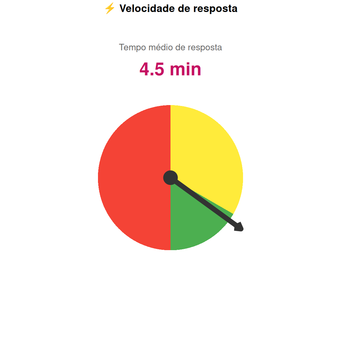
tempo_medio <- 4.5  # minutos

df_gauge <- data.frame(
  categoria = c("Rápido", "Normal", "Lento"),
  start = c(0, 5, 15),
  end = c(5, 15, 30),
  fill = c("#4caf50", "#ffeb3b", "#f44336")
)

ggplot() +
  # Fundo do gauge
  geom_rect(data = df_gauge, aes(xmin = start, xmax = end, ymin = 0, ymax = 1, fill = fill)) +
  # Ponteiro
  geom_segment(aes(x = tempo_medio, xend = tempo_medio, y = 0, yend = 1.2),
               color = "#333", size = 3, arrow = arrow(length = unit(0.3, "cm"))) +
  geom_point(aes(x = tempo_medio, y = 0), size = 8, color = "#333") +
  # Texto
  annotate("text", x = 15, y = 1.5, label = paste0(tempo_medio, " min"),
           size = 8, fontface = "bold", color = "#c51162") +
  annotate("text", x = 15, y = 1.8, label = "Tempo médio de resposta",
           size = 4, color = "#666") +
  scale_fill_identity() +
  coord_polar(theta = "x", start = pi, direction = -1) +
  xlim(0, 30) +
  theme_void() +
  theme(plot.title = element_text(face = "bold", hjust = 0.5)) +
  labs(title = "⚡ Velocidade de resposta")
```
## 14. VS Battle (palavras mais usadas)
```{r}
#| label: vs-battle
#| fig-width: 10
#| fig-height: 6
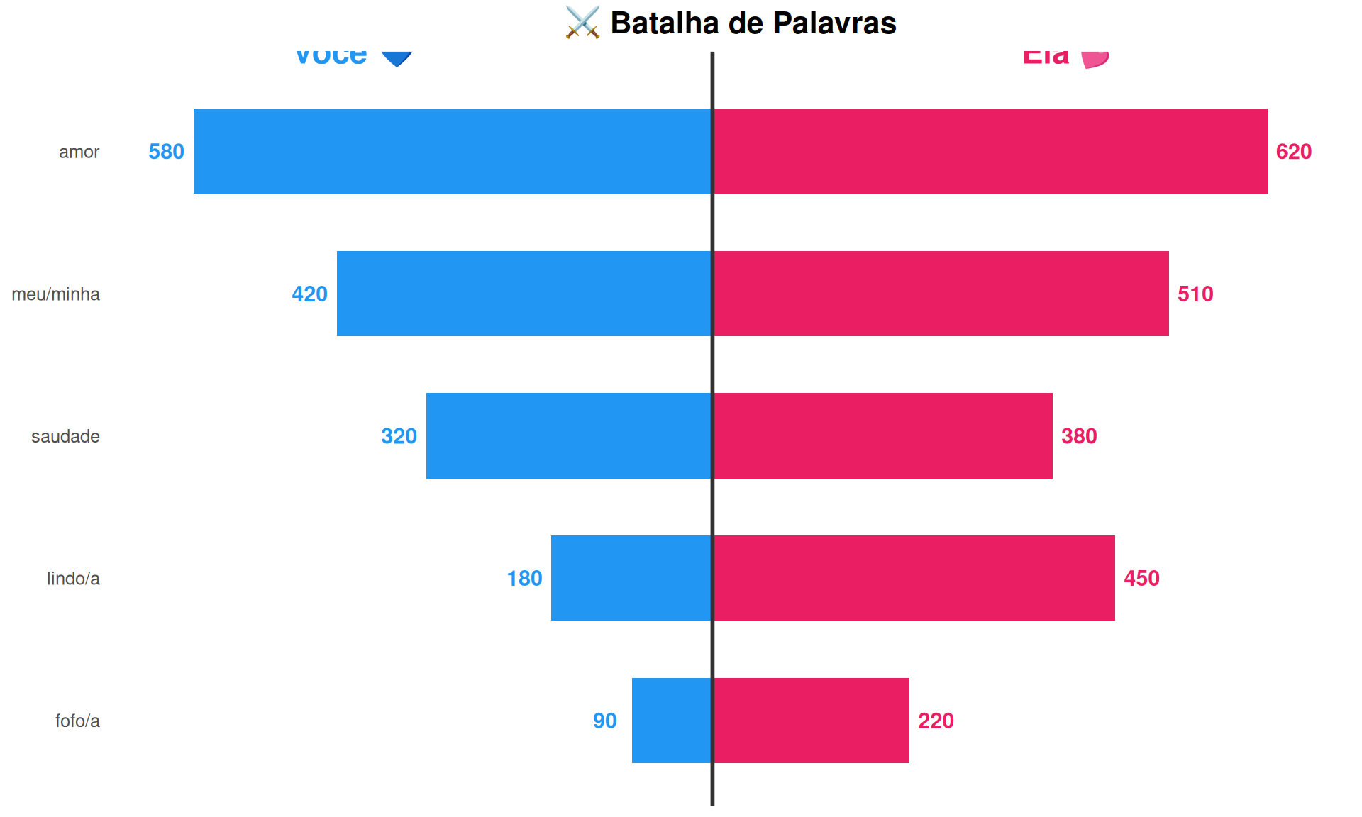
df_vs <- data.frame(
  palavra = c("amor", "saudade", "lindo/a", "fofo/a", "meu/minha"),
  voce = c(580, 320, 180, 90, 420),
  ela = c(620, 380, 450, 220, 510)
) %>%
  mutate(
    diff = ela - voce,
    winner = ifelse(diff > 0, "Ela 💕", "Você 💙")
  )

ggplot(df_vs) +
  # Barras Você (esquerda)
  geom_col(aes(x = -voce, y = reorder(palavra, voce + ela)),
           fill = "#2196F3", width = 0.6) +
  geom_text(aes(x = -voce - 30, y = palavra, label = voce),
            color = "#2196F3", fontface = "bold", size = 4) +
  # Barras Ela (direita)
  geom_col(aes(x = ela, y = reorder(palavra, voce + ela)),
           fill = "#E91E63", width = 0.6) +
  geom_text(aes(x = ela + 30, y = palavra, label = ela),
            color = "#E91E63", fontface = "bold", size = 4) +
  # Linha central
  geom_vline(xintercept = 0, color = "#333", size = 1) +
  # Labels
  annotate("text", x = -400, y = 5.7, label = "Você 💙", size = 6, fontface = "bold", color = "#2196F3") +
  annotate("text", x = 400, y = 5.7, label = "Ela 💕", size = 6, fontface = "bold", color = "#E91E63") +
  theme_minimal(base_size = 12) +
  theme(
    panel.grid = element_blank(),
    axis.text.x = element_blank(),
    plot.title = element_text(face = "bold", hjust = 0.5, size = 16)
  ) +
  labs(
    title = "⚔️ Batalha de Palavras",
    x = NULL,
    y = NULL
  )
```
## 15. Timeline dos marcos
```{r}
#| label: timeline-marcos
#| fig-width: 12
#| fig-height: 5
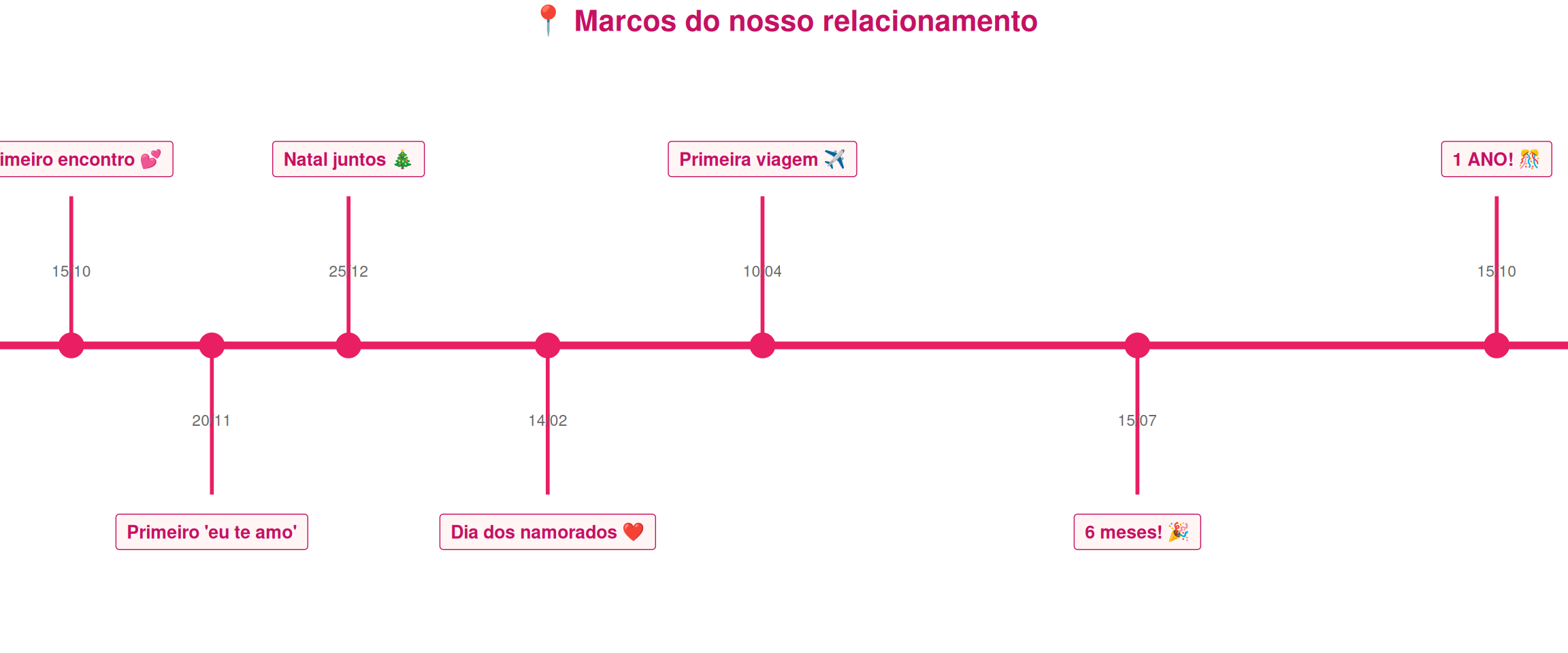
df_marcos <- data.frame(
  data = as.Date(c("2024-10-15", "2024-11-20", "2024-12-25", "2025-02-14",
                   "2025-04-10", "2025-07-15", "2025-10-15")),
  evento = c("Primeiro encontro 💕", "Primeiro 'eu te amo'", "Natal juntos 🎄",
             "Dia dos namorados ❤️", "Primeira viagem ✈️", "6 meses! 🎉", "1 ANO! 🎊"),
  y = c(1, -1, 1, -1, 1, -1, 1)
)

ggplot(df_marcos, aes(x = data, y = 0)) +
  # Linha do tempo
  geom_hline(yintercept = 0, color = "#E91E63", size = 2) +
  # Pontos
  geom_point(size = 6, color = "#E91E63") +
  # Linhas verticais
  geom_segment(aes(xend = data, y = 0, yend = y * 0.8), color = "#E91E63", size = 1) +
  # Labels
  geom_label(aes(y = y, label = evento), fill = "#fff5f5", color = "#c51162",
             fontface = "bold", size = 3.5, label.padding = unit(0.5, "lines")) +
  # Datas
  geom_text(aes(y = y * 0.4, label = format(data, "%d/%m")), size = 3, color = "#666") +
  scale_y_continuous(limits = c(-1.5, 1.5)) +
  theme_void() +
  theme(
    plot.title = element_text(face = "bold", hjust = 0.5, size = 16, color = "#c51162")
  ) +
  labs(title = "📍 Marcos do nosso relacionamento")
```
---
# 🎁 Final: Montagem Especial
```{r}
#| label: mensagem-final
#| fig-width: 10
#| fig-height: 8
# Mensagem final com coração
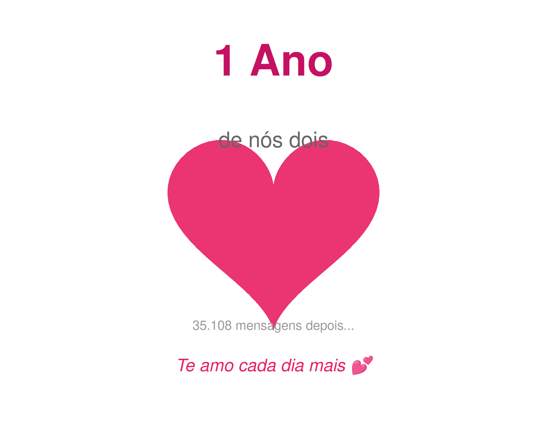
ggplot() +
  geom_polygon(data = heart %>% mutate(x = x/20, y = y/20),
               aes(x, y), fill = "#E91E63", alpha = 0.9) +
  annotate("text", x = 0, y = 1.2,
           label = "1 Ano", size = 20, fontface = "bold", color = "#c51162") +
  annotate("text", x = 0, y = 0.6,
           label = "de nós dois", size = 10, color = "#666") +
  annotate("text", x = 0, y = -0.8,
           label = paste0(format(total_msgs, big.mark = "."), " mensagens depois..."),
           size = 6, color = "#999") +
  annotate("text", x = 0, y = -1.1,
           label = "Te amo cada dia mais 💕", size = 8, fontface = "italic", color = "#E91E63") +
  theme_void() +
  coord_fixed(xlim = c(-1.5, 1.5), ylim = c(-1.5, 1.5))
```
---
*Feito com 💕 para celebrar nosso amor*